
A map can show where an election is being won or where violence has been reported, but it cannot tell the whole story by itself. A large area shaded in one color may contain relatively few voters. A cluster of conflict markers may represent many separate incidents with few reported casualties, while a single marker may represent a much more severe event.
The safest method is to read the map and statistics as two parts of the same claim. First determine what the map measures. Then check whether the numbers use the same locations, dates, definitions, and update time. Finally, look for what is missing or still uncertain.
This process usually takes only a few minutes and is more useful than switching between multiple news dashboards without knowing whether their figures are actually comparable.
Start by Identifying Exactly What the Map Measures
Do not begin by asking which color or region appears dominant. Begin with the map title, legend, date range, unit, and geographic level.
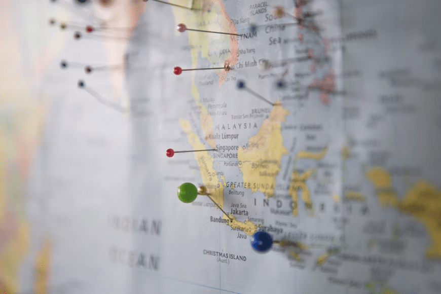
An election map may show the leading candidate in each district, vote share, winning margin, turnout, seats won, or projected control. These are not interchangeable. A winner-by-region map colors an entire area according to the candidate who is currently ahead, even when the margin is extremely small. It also gives large rural regions much more visual space than densely populated cities.
That means the amount of colored land does not reveal the national vote total. A candidate can appear to dominate the map geographically while receiving fewer votes overall, because maps represent territory rather than the number of people living in that territory. Choropleth maps are most reliable when the legend clearly presents a comparable rate, percentage, or margin rather than leaving the reader to infer importance from area alone.
Conflict maps require the same caution. Check whether the markers represent armed clashes, airstrikes, attacks on civilians, reported deaths, displaced populations, damaged buildings, or changes in territorial control. A map of incidents answers “Where were events reported?” It does not necessarily answer “Where were the most people killed?” or “Which side controls this territory?”
Also examine how markers are grouped. On an interactive map, several events may be combined into one circle when zoomed out. The circle may become larger because it contains more records, not because one event was exceptionally severe. Zooming in can reveal whether the apparent hotspot is one location or many nearby incidents.
Before drawing a conclusion, write the map’s meaning as a simple sentence:
This map shows the leading candidate by district based on results reported by 10 p.m.
or:
This map shows reported political-violence events recorded during the previous seven days.
When you cannot complete that sentence confidently, the visualization has not yet provided enough context.
Match the Numbers to the Same Place, Period, and Definition
After identifying the map’s variable, inspect the accompanying table, chart, or statistics. The figures must describe the same geographic unit and time period.
For an election, check whether the map shows districts while the table reports national totals. Both may be accurate, but they answer different questions. The district map helps identify geographic patterns; the national table shows the total vote. A seat map may also differ sharply from the popular vote because electoral systems convert votes into seats according to district boundaries and local rules.
Next, check how much counting is complete. Do not assume that “90% of precincts reporting” always means 90% of ballots have been counted. Precincts can vary greatly in population, and mail, early, provisional, or overseas ballots may be reported through different systems. For this reason, some election reporting organizations estimate the percentage of the expected total vote that has been counted rather than relying exclusively on precinct totals. That estimate can also change as more information becomes available.

The next question is more important than the percentage completed: Where are the remaining votes?
A candidate leading statewide may still be vulnerable when uncounted ballots are concentrated in an opponent’s strongest urban areas. Conversely, late-reporting rural districts may change a result that initially appears favorable to city-based voters. Look for county- or district-level completion data, outstanding ballot notes, and whether election officials describe the numbers as unofficial, preliminary, certified, or subject to recount.
For conflict statistics, definitions matter even more. An “event” may refer to one coded occurrence at a particular date and location. It does not automatically represent one death, one battle, or one day of fighting. ACLED, for example, tracks event characteristics such as actors, location, date, and event type, and it does not require a reported fatality for an event to enter the dataset. Therefore, 100 recorded events should not be described as 100 fatal attacks.
Similarly, reported fatalities, confirmed fatalities, injured people, missing people, and displaced people are separate measures. Casualty figures may come from hospitals, governments, military sources, local organizations, media reports, or international agencies. Different sources can apply different verification standards and update schedules.
When two conflict dashboards show different totals, compare these four details before deciding that one is wrong:
| Check | Why it matters |
|---|---|
| Reference period | One figure may cover the past week while another is cumulative |
| Geographic boundary | A city, province and entire country cannot be compared directly |
| Included event types | One dataset may include protests or remote violence while another does not |
| Source and methodology | Reports may use confirmed cases, reported cases or modeled estimates |
A difference in totals often reflects methodology rather than a simple factual contradiction.
Check What the Visualization Can Hide
Once the map and numbers match, test whether the presentation still creates a misleading impression.
First, distinguish totals from rates. A highly populated region may record the largest number of incidents, voters, or displaced people simply because more people live there. A rate per 100,000 people, percentage of registered voters, turnout rate, or share of the local population affected may provide a more meaningful comparison.
The reverse problem can also occur. A small region may have a high rate based on very few cases. Check the underlying total before treating it as a major hotspot.
Second, inspect the color scale. A map can make small differences look dramatic when it uses many sharply contrasting categories. Another map can hide important differences by placing a wide range of values in the same color band. Look at the actual thresholds in the legend rather than interpreting color intensity emotionally.

For election maps, distinguish between a candidate leading by 0.2 percentage points and leading by 25 points. Both regions may use the same party color even though their political situations are completely different. Margin maps or detailed tables are generally better than simple winner-only maps when the contest is close.
Third, check for missing data. Gray areas may mean no incidents, but they may also mean no available reports, delayed reporting, inaccessible territory, or incomplete counting. The legend or methodology should explain the distinction. Absence of reported activity is not always evidence that nothing happened.
Conflict reporting is particularly vulnerable to uneven visibility. Events in locations with strong media access, hospitals, civil-society networks, or internet connectivity may be documented more quickly than events in inaccessible areas. Near-real-time datasets should therefore be treated as developing records rather than complete measurements of everything that has occurred.
Fourth, examine whether territorial-control maps use clear categories and dates. Labels such as “controlled,” “contested,” “claimed,” and “area of operations” have different meanings. Front lines may also change faster than the map is updated. Do not combine a control map dated Monday with incident statistics updated Friday and describe them as a single current snapshot.
Finally, compare at least one additional reliable source when a claim is consequential. For elections, prioritize official election authorities for count status and certification, while recognizing that news organizations may present faster projections and expected-vote estimates. For conflict and humanitarian reporting, consult the source named in the visualization, its methodology page, and relevant international or specialist datasets. OCHA and its Humanitarian Data Exchange provide access to maps and datasets from many organizations, but each item still needs to be checked for source, date, coverage, and definitions.
A practical final check is to answer five questions:
- What exactly does the map encode?
- Do the statistics cover the same places and dates?
- Are the values totals, percentages, rates, estimates, or confirmed figures?
- How complete is the reporting, and what may still be missing?
- Would the same conclusion remain valid after considering population, uncounted votes, reporting delays, and source methodology?
When all five answers are clear, the map and statistics can be used together with reasonable confidence. When one remains unclear, describe the conclusion as provisional rather than treating the visualization as definitive.